
A designer collab between SKECHERS, the global footwear brand, and James Goldcrown, an urban graffiti artist.
We were approached by Skechers to design some retail displays for an upcoming collaboration. The client stated they needed our design team to embrace the idea that this is a collaboration between Skechers and an urban graffiti artist. Equally important, we needed to ask our designers to do something that doesn’t look like anything that we’ve ever shown before. In other words, the client didn’t want normal.
Our goal was to design POP fixtures and displays that would stand out and grab somebody’s attention when they walk into a store. Also, to make them immediately realize this collaboration between Skechers and James Goldcrown is something unique and different.
Jam Sessions – Where innovation begins
Part of our design process is what we call our Jam Sessions. We will have different design members work on a project to have different takes. A lot of them start with sketches. Then our team just meets and brainstorms different shapes and ideas. From that, the designers will then take some direction and make it their own. Most of the projects we have are collaborative.
Keeping in mind they didn’t want normal, Steve, our VP of design, along with designers Thomas Perugini and Natasha Watkins started the design sketches with the idea that in an urban landscape you are constantly dealing with unknowns, and nothing is the same one block to the next. These concepts were translated to the risers with different graffiti and shapes that are friendly to each other but very unique and different from what we had typically done.
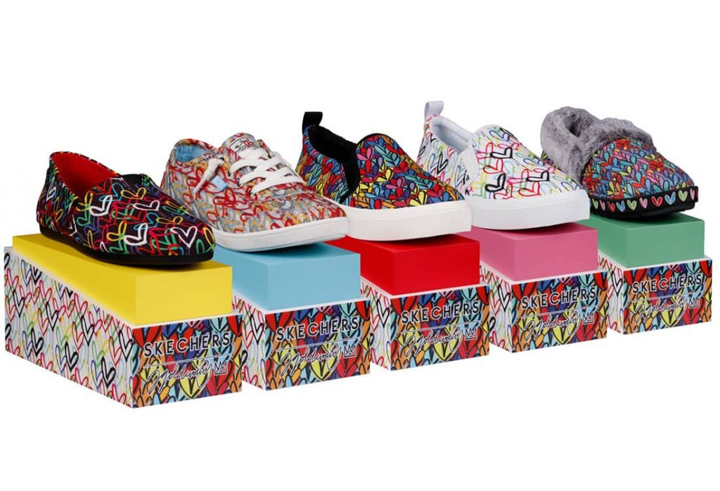
From that, the client liked the direction our team was headed with the general aesthetics of the riser. Additionally, they wanted to hone in on some key artwork from James Goldcrown, such as the white backdrop and the darker backdrop. Our designers had to figure out how to use both of these James Goldcrown imageries that were sometimes tied into the shoes, into the displays. Also, the customer wanted to have specific colors tied to specific lines or seasonal launches.
Helping brands bring their stories and products to life
Skechers also needed a small floor stand that had bright colors plus the James Goldcrown aesthetics, and feel. Our team wanted to incorporate some of the iconic imagery in different ways for the floor stand. Because it’s a graffiti artist it was important to our designers to bring in the street feel. They achieved this by incorporating a concrete backdrop and have James Goldcrown’s heart as an identifiable icon.
The use of primary colors is important in James Goldcrown’s art. So our designers were just pulling specific colors that are prevalent in his artwork for accents along the shelves – making the shelves as fun and playful as his art is. For this design, Steve told his team “Let’s not have it look the same from any two angles, any two sides.” Skechers loved that idea.

Understanding a brand’s DNA
Our customers are our priority, and creating quality products that perfectly complement their brand is our goal. Sometimes, this means multiple design proposals before we land on the winning design.
During our proposal stage, we presented a design for the floor stand which included a brick texture and a canopy, just as you can see in some shops in Manhattan. Another design had a side wedge and the James Goldcrown artwork was peeking through. One team at Skechers liked the designs. But when it was presented to the Retail Team, retail floor realities came into play and we realized we can’t have that wedge because a customer could get their sleeve caught and could topple the display over. Or even worse, they could get hurt. So, sometimes our customers have to simplify our design because of limitations on the retail floor.
Benefits of working in a collaborative environment
It takes a team of very talented and dedicated people as we have to bring our ideas to life. After our designs were approved our project managers went to work on production. A challenge they faced was to make sure the paint on the shelf, the digital print on the papers, and a different graphic printed on the melamine were consistent. They had to make sure all the red stays consistent no matter what surface it is on. Color consistency across a multitude of different materials and finishes is challenging. Being able to get paint to match ink can be difficult, but we did it. This was achieved during our prototype process. Thus making it such an important part of our design and pre-production process. It’s one of the things that makes Chippenhook so unique because “we get it right before we make your production.”
Our designers are always conscious of all aspects of design and production. For instance, the floor stand was designed to ship flat, as a knock-down design. Some of the questions they had in mind when designing were: How big will it be when it ships? How heavy will it be? The final design is very easy to assemble at the store level. Plus, because it ships flat, it saves money on shipping.
Overall, Skechers was really excited with the end product, our design team had created exactly what they had asked for.
If you want more info on how to work with us enter your email below.